Introduction
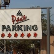
Outdoor advertising is one of the most powerful tools for brand visibility. Whether it’s on a highway, a building rooftop, or a city center, a well-designed hoarding can leave a lasting impression on thousands of viewers every day. But not every billboard or hoarding board achieves that level of impact. The secret lies in the hoarding board design — the visual strategy that combines creativity, clarity, and purpose.
A hoarding board is not just a big printed sheet; it’s a communication tool. Its design has to work fast and work smart. Within just a few seconds, it must grab attention, deliver a message, and leave a memory. In this guide, we’ll explore everything you need to know about effective hoarding board design — from layout principles to branding alignment, from typography to color psychology, and much more.
Why Hoarding Board Design Matters
Design is not just about beauty — it’s about communication. A poorly designed hoarding, even if placed at a prime location, will fail to catch attention or deliver its message clearly. On the other hand, a strong and professionally thought-out hoarding board design can do wonders for brand awareness and campaign performance.
Viewers typically spend only 3 to 5 seconds looking at a hoarding. That means your design must be optimized for quick understanding. Every element — image, text, logo, color — must work together to make the message unforgettable. This is why companies, brands, and agencies invest in professional designers and creative direction when it comes to outdoor advertising.
Key Elements of Effective Hoarding Board Design
There are several visual and strategic elements that go into designing an impactful hoarding. Let’s break down the most essential ones.
First comes simplicity. A cluttered hoarding with too much text or too many visuals will confuse the viewer. Instead, the message should be short, bold, and clear. Think of it as a billboard version of a headline — it must tell the story in one quick glance.
Next is color usage. Colors are powerful tools in outdoor design. Bright, contrasting colors attract attention, while brand-specific colors help with recognition. However, using too many shades or clashing palettes can hurt readability. It’s essential to balance creativity with visibility.
Then comes typography. The fonts used in hoarding board design must be bold and legible from a distance. Thin or decorative fonts may look nice up close but will be unreadable on a large board 30 feet in the air. Stick with clean, bold typefaces and make sure the text is sized appropriately based on viewing distance.
Images and graphics also play a crucial role. A powerful image can say more than a hundred words. Use high-resolution visuals that support the message, not distract from it. The image should align with the brand tone and speak directly to the audience.
Finally, never ignore brand consistency. The hoarding should reflect your brand’s identity — logo, tagline, fonts, and colors must all align with your digital and print campaigns. This helps build recognition and trust with the audience.
Size and Placement Considerations
The size and shape of the hoarding board directly influence design decisions. A vertical hoarding may demand a different layout than a horizontal one. Similarly, the distance from the viewer determines how big your text and graphics should be.
Designers must account for viewing angle, light direction, and surroundings. For example, a hoarding near traffic lights gives more time for viewing, while a highway board must deliver its message faster. Placement also affects color choices — a hoarding in a green, natural environment may need contrasting colors like red or yellow to stand out, while one in an urban setting might benefit from darker, more striking visuals.
Design for Day and Night Visibility
An often-overlooked part of hoarding board design is how it appears during different times of the day. If your hoarding is backlit or illuminated with external lights, your design must account for that. Avoid very dark designs for non-lit boards at night, as they’ll disappear. Use high-contrast colors and avoid low-resolution images that might pixelate when viewed in low light.
For backlit hoardings, designers must also optimize brightness, contrast, and image quality so that the design remains sharp and readable even when illuminated from behind.
Emotional Connection and Messaging
The most memorable hoardings are the ones that make people feel something. Emotionally-driven advertising works better than logic-based content, especially in outdoor media. A well-designed hoarding board can make people laugh, feel curious, get inspired, or think about a problem — all in just a few seconds.
This emotional pull often comes from powerful visuals, smart slogans, or relatable messaging. For example, a hoarding that shows a happy family enjoying a product might connect better with parents, while a humorous line might stick with young adults. Your hoarding board design should always consider your target audience’s mindset and emotional triggers.
Call to Action (CTA)
Every hoarding needs a clear and simple call to action — something that tells the viewer what to do next. This could be visiting a website, calling a number, visiting a store, or just remembering the brand. The CTA should be short, action-oriented, and placed in a visible area of the hoarding.
Examples of effective CTAs include:
“Call Now”, “Visit Today”, “Shop Online”, or “Scan the QR code.”
In modern designs, even a QR code itself can act as a CTA if placed well and sized correctly.
Common Mistakes to Avoid
Many hoarding board designs fail because they ignore basic design principles. One of the most common mistakes is using too much text. Outdoor viewers don’t have time to read long paragraphs. Another mistake is poor color contrast, which makes the hoarding hard to read from a distance.
Also, avoid low-quality images and logos. These not only make your brand look unprofessional but also reduce the visual impact of the design. Lastly, never place essential information near the edges of the board — these areas are more likely to get cut off or blocked, especially if other objects (like poles or trees) are nearby.
Design Trends in Modern Hoardings
Today’s hoarding board designs are more creative than ever. From minimalist styles with bold fonts and plain backgrounds to interactive digital hoardings with changing content, the options are endless. Augmented reality (AR), QR code integration, and eco-friendly hoardings are also trending in urban areas.
Another popular trend is storytelling — using a series of hoardings placed in sequence along a road to tell a short story or walk the viewer through a brand journey. This approach creates engagement and makes the experience memorable.
Conclusion
A powerful hoarding board design is a blend of creativity, strategy, and technical understanding. It’s not just about looking good — it’s about delivering a clear, strong message that stays with the viewer long after they’ve passed the board. From the layout and colors to font selection and emotional impact, every detail contributes to success.